
What's new in Akira UI 3.2.0
A time picker and a date and time picker for forms, plus charts and stat cards that show the exact figure, with percentages in your locale.
I released 3.2.0 of Akira UI, a React component library built on shadcn primitives. Besides the usual buttons, dialogs and tables, it ships app shells, ready-made blocks, translated labels and an Inertia adapter.
This release is mostly about two kinds of screen: forms that need a time, and dashboards that need numbers. It’s a minor release, so coming from 3.1.0 you only need to bump the version. The screenshots below are the examples from ui.akira-io.com rendered with 3.2.0, with the data table example cut down to a single row.
Picking a time, or a date and a time
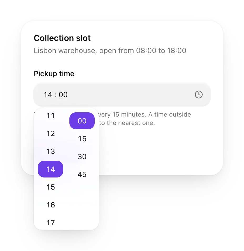
The library had a DatePicker but nothing for picking a time. TimePicker fills that gap. In this example a warehouse takes pickups between 08:00 and 18:00, one slot every 15 minutes:
<TimePicker
    value={pickup}
    onChange={setPickup}
    minuteStep={15}
    minTime="08:00"
    maxTime="18:00"
/>
You can type the hours and minutes into the field or pick them from the columns, and the value comes back as a plain HH:mm string. If you leave out hourCycle, the picker asks Intl.DateTimeFormat for the hour cycle of the date locale set on UiLocaleProvider, so a Portuguese app gets a 24-hour clock and an American one gets AM and PM.
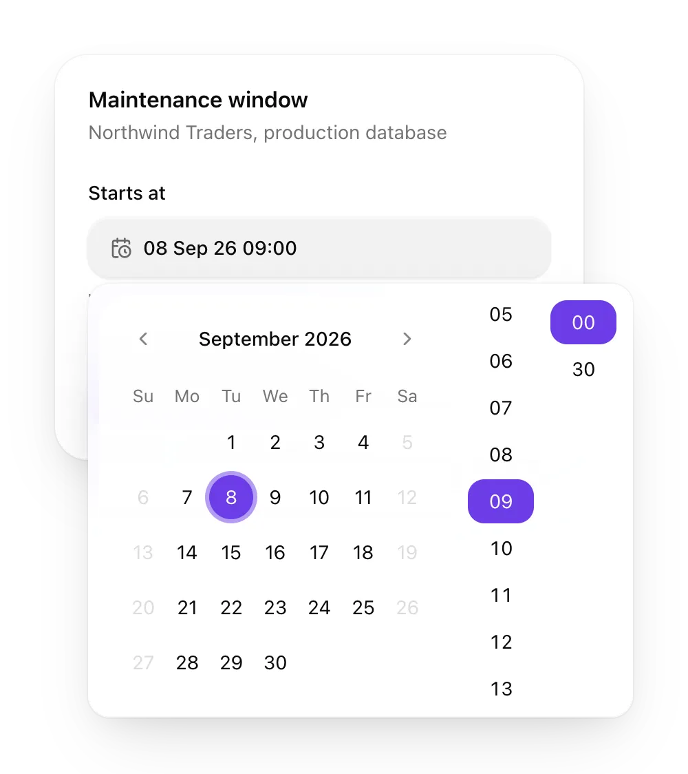
When the form needs a moment rather than a time of day, DateTimePicker puts the calendar and the same columns side by side and returns a Date. Here the maintenance window can only start on a weekday in September, in steps of 30 minutes:
<DateTimePicker
    value={start}
    onChange={setStart}
    minDate={opensAt}
    maxDate={closesAt}
    disabledDays={isWeekend}
    minuteStep={30}
/>
minDate and maxDate bound the time as well as the day: on the first or last allowed day, the columns stop at that bound’s time. Both pickers ship their labels in Portuguese, Spanish and French.
Exact figures in charts
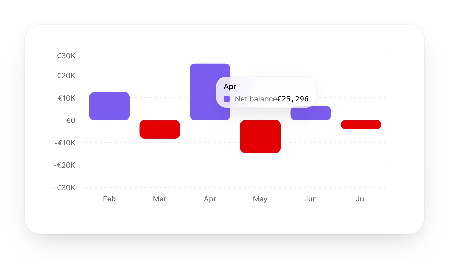
A net balance that is positive one month and negative the next is easier to read with zero in the middle, a line through it, and the losses in another colour:
<BarChart
    data={balanceByMonth}
    series={['balance']}
    xKey="month"
    yDomain="symmetric"
    referenceLines={[{ y: 0 }]}
    colorBy={(datum) =>
        Number(datum.balance) < 0 ? 'var(--destructive)' : 'var(--chart-1)'
    }
    yFormat={{ style: 'currency', currency: 'EUR', notation: 'compact' }}
/>
yDomain="symmetric" takes the largest absolute value, rounds it up and mirrors it, so the April peak of 25,296 gives an axis from -30,000 to 30,000. The red comes from colorBy, which takes either a function of the row or 'category' to give each row its own palette colour.
The axis stays compact, counting in steps of €10K, but the tooltip now shows the exact value by default: €25,296 for April. For rankings there’s variant="lollipop", and valueLabels prints the value on each mark. Line charts also take yScale="log", and an area chart can fade with fill="gradient".
A total split into parts
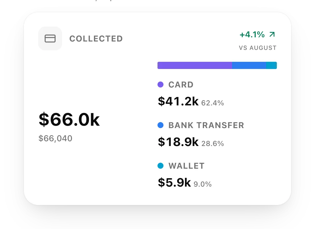
StatBreakdownCard puts the total on the left and, on the right, a bar with one segment per part and a legend underneath. Each segment can take focus and shows its label, share and exact value in a tooltip. CompositionBar is the same bar and legend without the card, for when you already have a card of your own.
The shares these components format, and the trend on StatCard, now follow a locale set on the provider. Without it they stay in en-US:
<UiLocaleProvider labels={ptLabels} dateLocale={pt} locale="pt-PT">
    <App />
</UiLocaleProvider>
The 62.4% above becomes 62,4% in pt-PT. A malformed tag such as pt_PT falls back to en-US instead of throwing.
The data table total
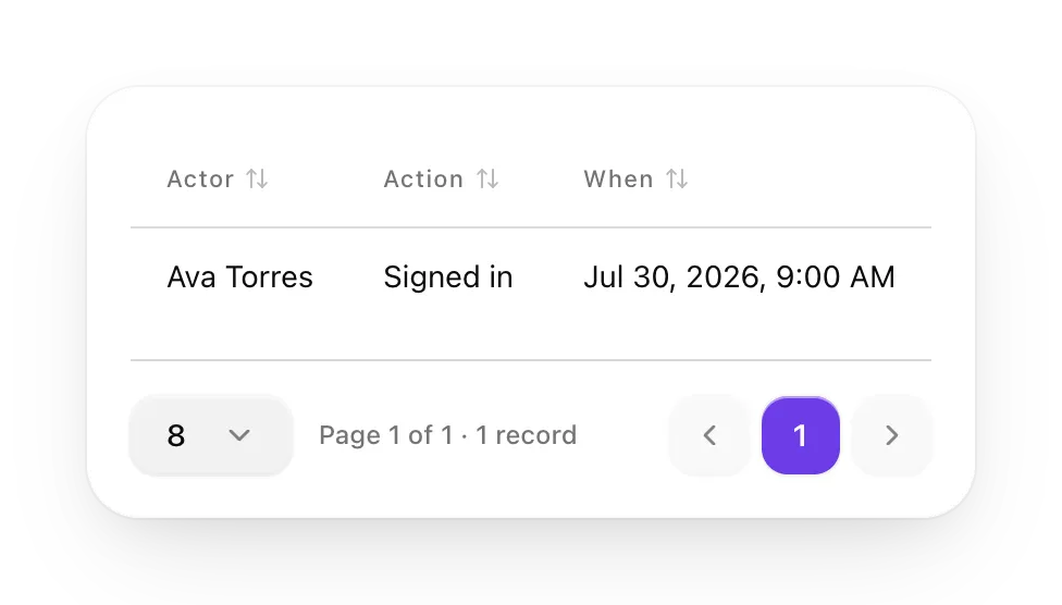
The total under the data table now picks singular or plural from the count with Intl.PluralRules. A table with one row says “1 record” instead of “1 records”, and the Portuguese and French labels follow the same rule.
Smaller changes
NotificationBellshows an unread badge and a popover, andInertiaNotificationBellpolls while the page is active.useFortifyTwoFactorconnects the two-factor blocks to Laravel Fortify.- Nav groups can nest, and
AppSidebarrestores the collapsed state it saved last time. Comboboxaccepts a filter function, andCommandDialogforwards props to the innerCommand.- A tour skips the steps whose target isn’t on the page, and its progress counts only the steps it shows.
In closing
With 3.2.0, a form can ask for a time without a custom input, and a dashboard can show the exact figure behind every bar. You can try each component on ui.akira-io.com. The full list of changes is in the release notes, and the package is on npm.